ARENA UI Elements
You can use several UI elements in the ARENA, including text and image panels, button panels, and popup prompts.
ARENAUI Card - a text and image panel
A card is a rectangular panel that can contain text and/or an image. It can be used to display information or act as a sign. Its layout will dynamic adjust according to the optional parameters that are provided: for instance, if no image is provided, then only text will be displayed. If only a title is provided, it will serve more as a label or sign. An optional close button may also added.
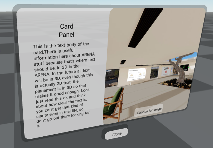
See the full ARENAUI Card schema for more details.
ARENAUI Button Panel
A button panel is a horizontal or vertical panel that contains buttons. Each button can have a
text or image label. When a button is clicked, a message is sent over pubsub with
the buttonName and buttonIndex.
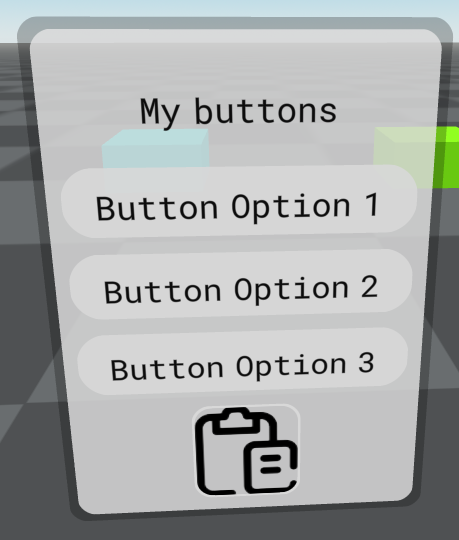
See the full ARENAUI Button Panel schema for more details.
ARENAUI Prompt
Similar to a button panel, this prompt is intended to be used a quick confirmation popup. Its buttons may be customized and an additional text description can be included, similar to what one may see in traditional 2D web interfaces.
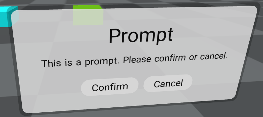
See the full ARENAUI Prompt schema for more details.